
A well-planned pharmacy is more than just a retail space. It’s the backbone of a successful healthcare business. The right pharmacy layout design is a smart tool that shapes every part of your operation. It affects how smoothly your staff works. It impacts how profitable your front-end is. It determines how safe and cared-for your patients feel.
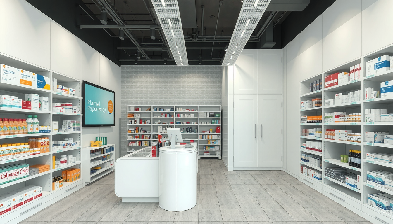
This process involves much more than just placing shelves. It’s about creating a complete, efficient system. For those just starting, understanding the whole journey is key. This includes everything from the business plan to the final build. Before focusing on design details, it’s vital to learn how to Open a Pharmacy.
This guide will cover the core principles of effective layout. We’ll explore different models to choose from. You’ll learn about workflow optimization and pharmacy interior design. We’ll also discuss common mistakes to avoid in 2026.
Key Takeaways
- Strategic Importance: A pharmacy’s layout directly impacts workflow efficiency and profitability. It affects patient safety and customer experience. It is a fundamental business decision, not just an aesthetic one.
- Core Zones: Every pharmacy has key zones. These include retail, prescription drop-off and waiting areas, the dispensary, the pick-up counter, and private consultation rooms. Each must be designed for its specific function.
- Workflow is King: The dispensary layout should follow the prescription lifecycle. This goes from intake to verification and pickup. This minimizes steps, reduces errors, and decreases patient wait times.
- Layout Models: The most common layouts are Grid, Free-Flow, and Hybrid. The best choice depends on your space and business goals. It also depends on the experience you want to create for patients.
- Avoid Common Pitfalls: Many pharmacies suffer from poor traffic flow and not enough storage. They lack privacy and fail to plan for future growth. Professional guidance can help prevent these costly errors.
The Foundation: Why Smart Pharmacy Layout is Essential
Investing time and money into a proper pharmacy layout design provides a significant return. It’s a foundational element that supports every business goal. Thinking strategically about your space from the beginning prevents costly renovations. It also prevents operational headaches down the line.
A smart layout is not an expense. It’s an investment in your pharmacy’s long-term health and success.
Here are the core benefits of a well-designed layout:
- Better Workflow Efficiency: A logical layout minimizes the steps staff take to fill a prescription. This reduces physical strain and speeds up the entire process. It allows pharmacists to spend more time with patients.
- Increased Profitability: Smart placement of over-the-counter products in the front-end retail area guides customers to high-margin items. Clear sightlines and well-organized aisles encourage browsing. This increases basket size.
- Improved Patient Safety and Compliance: A well-organized dispensary is a key defense against dispensing errors. Clear separation of workstations and proper storage reduces the risk of mix-ups. Thoughtful design also ensures patient privacy is protected. This is essential for compliance with regulations like HIPAA.
- Superior Patient Experience: An easy-to-navigate, comfortable, and professional-looking pharmacy builds trust. A positive experience turns a one-time customer into a loyal patient. They feel valued and cared for.
The Core Zones: Breaking Down the Modern Pharmacy
Every successful pharmacy layout design is built around distinct zones. Each has a specific purpose. Understanding these areas is the first step in planning your space. These zones are common elements in professional planning tools. You can see this in a typical pharmacy floor plan template.
The Retail and Merchandising Area (The Front-End)
This is the main customer-facing area of your store. It features over-the-counter medications, vitamins, supplements, and personal care items. It also includes other retail products. The key here is to create an inviting shopping environment.
Use bright lighting, clear signage, and wide aisles. This makes browsing easy and enjoyable. Your pharmacy interior design in this zone should encourage exploration.
The Prescription Drop-Off and Waiting Area
This area is often a patient’s first point of contact with the pharmacy staff. It needs to be clearly marked and accessible. It should be designed to offer a sense of privacy.
Comfortable seating and good lighting for reading are important. Perhaps a small, quiet area for children can greatly improve the waiting experience.
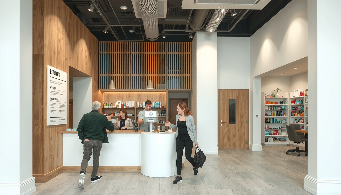
The Dispensary (The Prescription Workflow Hub)
The dispensary is the operational heart of the pharmacy. This is where prescriptions are received and entered into the system. They are filled and checked here. This space is not for customers.
Its design must prioritize efficiency and accuracy. An ergonomic layout for pharmacists and technicians is critical. This prevents fatigue and errors.
The Pharmacist Consultation and Pick-Up Counter
This counter serves two functions. It handles fast transactions for prescription pick-up. It also provides a space for brief pharmacist counseling. It should be separate from the drop-off area to manage traffic flow.
The design must allow for easy payment and bag hand-off. It should also provide enough space for a discreet conversation about medications.
The Private Consultation Room(s)
In 2026, a private consultation room is no longer a luxury. It’s a necessity. This is where pharmacists provide vaccinations and Medication Therapy Management services. They also provide in-depth patient counseling here.
This room must be soundproof, comfortable, and professional. This builds patient trust and expands clinical services.
Choosing Your Blueprint: Common Pharmacy Layout Models Explained
There is no one-size-fits-all solution for pharmacy layout design. The model you choose will depend on your pharmacy’s size and business focus. It also depends on the type of experience you want to offer. These models are widely recognized. They form the basis of many common pharmacy design layouts.
Below is a comparison of the three main layout types:
| Layout Type | Description | Best For | Pros | Cons |
|---|---|---|---|---|
| Grid Layout | Features long, parallel aisles of shelving, similar to a traditional grocery store. | Pharmacies with a large retail section and high foot traffic. | Maximizes product display space; efficient for restocking; customers are familiar with it. | Can feel impersonal; less conducive to browsing; may create a “racetrack” effect. |
| Free-Flow Layout | An open, organic layout with fixtures and displays arranged in a less structured pattern. | Boutique pharmacies focused on wellness, beauty, and high-end products. | Encourages browsing and discovery; creates a high-end feel; flexible and creative. | Less space-efficient; can be confusing if not designed well; may be harder for customers to find specific items. |
| Hybrid Layout | Combines elements of both grid and free-flow layouts. | Most modern community pharmacies that need to balance retail sales with professional services. | Offers the best of both worlds: efficient retail (grid) and a welcoming, professional pharmacy area (free-flow). | Requires careful planning to ensure the two styles merge seamlessly. |
Optimizing Workflow: A Step-by-Step Guide to Dispensary Design
A “workflow-first” approach to dispensary design is the secret to a highly efficient and safe pharmacy. Recent studies show that an optimized workflow can reduce dispensing errors by up to 40%. It also significantly cuts patient wait times. Your pharmacy layout design should map directly to the lifecycle of a prescription.
1. Intake/Drop-Off
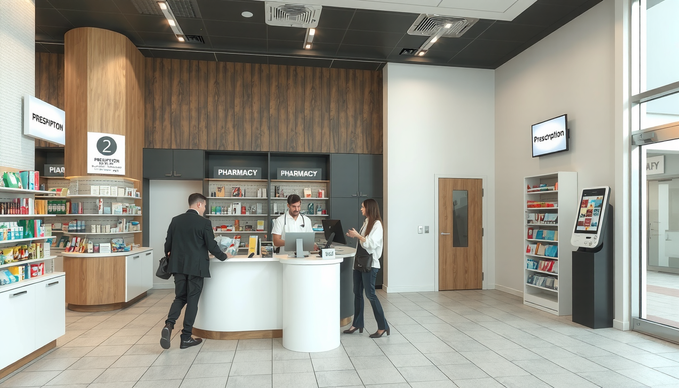
The prescription intake counter should be clearly visible from the entrance. But it should be separate from the pick-up area. This prevents congestion and confusion. A dedicated window or even a self-service kiosk can streamline this first step. This makes the process smoother for both patients and staff.
2. Data Entry and Verification
This workstation needs to be located near the intake area. But it should be positioned out of the main foot traffic path. It requires adequate space for computers, scanners, and reference materials.
Consider acoustic panels or a slightly shielded design to reduce noise. Staff will be on the phone with doctors’ offices and insurance companies.
3. Filling and Compounding
The filling station is where technicians spend most of their time. A “U” or “C” shaped workstation is ideal. It minimizes steps and keeps everything within arm’s reach. Fast-moving drugs should be stored in easily accessible drawers. They can also be on shelves directly in front of or beside the station.
If you offer compounding, this area must be physically separate. This meets USP standards and prevents cross-contamination.
4. Pharmacist Verification
This is the final quality control checkpoint. The pharmacist’s verification station should have a clear, commanding view of the entire dispensary workflow. It needs ample counter space to safely review the original prescription. They also review the filled medication and the labeling. Good lighting is non-negotiable here.
5. Will-Call and Patient Counseling
Once verified, prescriptions are stored in a will-call system. A well-organized system is crucial for fast retrieval. Use bags or bins arranged alphabetically or numerically. The pick-up counter should be designed to facilitate both a quick transaction and a private conversation. This creates a positive final impression.
The Human Element: Mastering Pharmacy Interior Design for Patient Trust
Effective pharmacy interior design goes beyond function. It’s about using visual cues to communicate professionalism, care, and trustworthiness. The right colors, lighting, and materials can transform a clinical space. They can make it into a healing environment.
The Psychology of Color and Lighting
Colors and light have a powerful effect on mood. A thoughtful pharmacy interior design uses this to its advantage.
- Colors: Calming blues and greens are excellent choices for waiting areas. They can help reduce patient anxiety. Clean whites and light grays communicate sterility and professionalism. This is especially true in the dispensary. Use bolder brand colors as accents in the retail section. This draws attention and builds brand identity.
- Lighting: Lighting should be layered. Use bright, clear task lighting in the dispensary to ensure accuracy. In the retail and waiting areas, use warmer, more inviting ambient lighting. Accent lighting can be used to highlight high-margin products or promotional displays.
Materials, Textures, and Fixtures
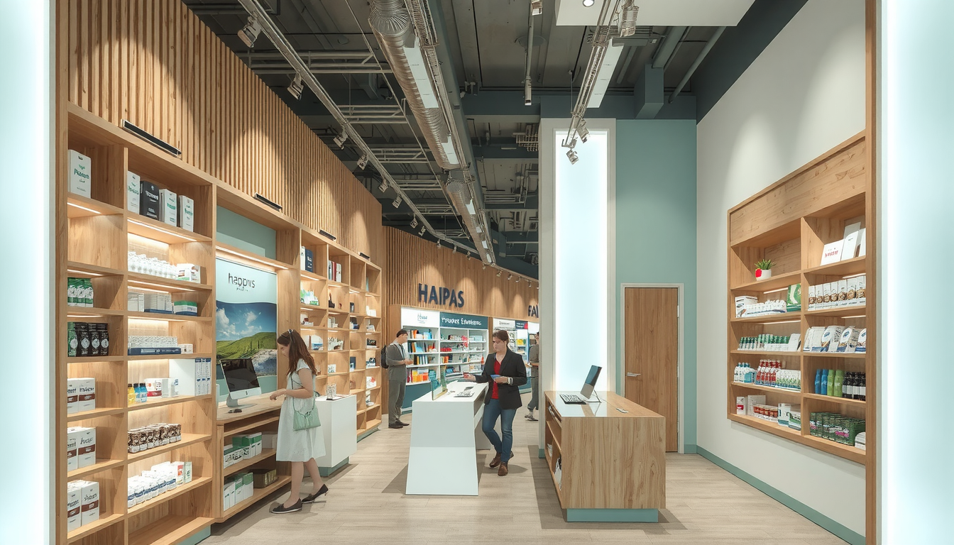
The surfaces in your pharmacy must be durable and easy to clean. Non-porous materials like laminate, solid surface, and quartz are excellent for counters. However, you can soften the clinical feel by incorporating natural elements.
Wood-look flooring or accents can help. Even a few well-placed plants can make the space feel more welcoming and less sterile.
Accessibility and Inclusivity
A truly great pharmacy is accessible to everyone. This means following ADA (Americans with Disabilities Act) guidelines is the bare minimum. Your pharmacy layout design should include wide aisles for wheelchairs and walkers. It should have counters at accessible heights and clear, large-print signage.
An inclusive design shows that you care about every member of your community.
Small Space, Big Impact: Pharmacy Layout Design for Compact Locations
Many independent pharmacies operate in smaller footprints. But limited square footage doesn’t have to mean a compromised design. A smart pharmacy layout design for a compact location focuses on efficiency. It also creates an illusion of space. There are many great ideas for optimizing space in a small pharmacy.
Here are some actionable tips for small pharmacies:
- Go Vertical: Use floor-to-ceiling shelving and high-density drawer systems. This maximizes every inch of wall space. This is especially useful in the dispensary for drug storage.
- Multi-Functional Furniture: Choose fixtures that can do double duty. A consultation desk could have built-in product displays. Waiting area benches could include storage underneath.
- Use Mirrors and Light Colors: Strategic placement of large mirrors can make a narrow space feel wider. Painting walls in light, neutral colors reflects more light. This creates an open, airy feeling.
- Sliding Doors: For consultation rooms or back offices, use sliding or pocket doors. They eliminate the “swing space” required by traditional doors. This frees up valuable floor area.
- Compact Robotic Dispensers: As technology evolves, robotic dispensing systems are becoming smaller and more affordable. These can dramatically increase storage capacity and efficiency in a tiny dispensary footprint.
Common Pitfalls in Pharmacy Layout Design (And How to Avoid Them)
From our experience in designing hundreds of pharmacies, we’ve identified several recurring mistakes. These can hurt efficiency and profitability. A smart pharmacy layout design anticipates these issues from the start.
-
Pitfall 1: Poor Flow and Bottlenecks. This happens when customer and staff paths cross in awkward ways. This is especially true near the pharmacy counter.
- Solution: Before finalizing your plan, literally trace the typical journey of a patient and a prescription on your floor plan. Identify and eliminate any areas of congestion.
-
Pitfall 2: Inadequate Storage. Many owners underestimate their inventory needs. This leads to cluttered workspaces and disorganized stock rooms.
- Solution: Plan for at least 20% more storage than you think you need for day one. This gives you room to grow your inventory. It helps you adapt to changing product demands.
-
Pitfall 3: Neglecting Privacy. Open-concept counters where sensitive conversations can be easily overheard erode patient trust. They can also violate privacy regulations.
- Solution: Use design elements like frosted glass dividers and sound-absorbing acoustic panels. Most importantly, include a dedicated, fully private consultation room.
-
Pitfall 4: Forgetting Future Growth. A layout that is too rigid can’t adapt to new technologies or services.
- Solution: Use modular fixtures that can be easily moved or reconfigured. Plan extra space and electrical/data ports for future technology. This includes robotic dispensers or additional computer terminals.
Avoiding these complex issues is why many pharmacy owners choose to work with a professional. An expert in pharmacy design can foresee these challenges. They can create a plan that is efficient, compliant, and built for long-term success in 2026 and beyond.
FAQ about Pharmacy Layout and Interior Design
What is the most efficient layout for a pharmacy?
There is no single “most efficient” layout for all pharmacies. Efficiency depends on your specific business model. However, a Hybrid Layout is often the most effective for modern community pharmacies. It combines a structured grid for retail with a highly optimized, workflow-centric design for the dispensary.
How much space do I need for a private consultation room?
A comfortable and ADA-compliant private consultation room should be at least 70-100 square feet. This is approximately 6.5-9.3 square meters. This allows space for a desk, two chairs, and maneuverability for a wheelchair. This ensures a private and professional setting.
How can I improve customer flow in my existing pharmacy layout?
Start by ensuring your main aisles are at least 3-4 feet wide. Place your pharmacy counter at the back to draw customers through the retail space. Use clear, overhead signage to direct traffic to different zones. These include “Prescription Drop-Off,” “Pick-Up,” and specific over-the-counter categories.
What are the key differences between a retail and a hospital pharmacy layout?
A retail pharmacy layout design must balance a patient-facing retail space with an efficient dispensary. A hospital pharmacy layout is almost entirely focused on internal workflow, efficiency, and sterile environments. This includes IV rooms, with little to no public-facing retail component.
How does lighting affect pharmacy interior design?
Lighting is critical for both function and feel. Use bright, focused “task lighting” (50-100 foot-candles) in the dispensary to ensure accuracy and reduce staff eye strain. In retail and waiting areas, use warmer “ambient lighting” to create a comfortable, welcoming atmosphere. Use “accent lighting” to highlight key products.







 English
  Arabic